Brand Design
No Bois Allowed.
A women-only self-care and wellness store by Proactive For Her, designed with a distinct identity from the parent brand.
Logo
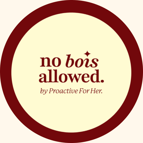
The logo was designed to feel bold, approachable, and instantly recognizable. Expressive serif typography gives it a distinctive character and strong visual presence. The result is a versatile identity that works seamlessly across different brand touchpoints.
An inverse cream version of the mark supports use on darker surfaces, keeping the same character wherever it appears.
Color palette
Dark Garnet
CMYK : 0, 93, 89, 55
HEX : #72080C
Soft Cream
CMYK : 0, 1, 17, 0
HEX : #FFFCD3
The color palette combines dark garnet and soft cream tones to create a balance between bold expression and approachability. Garnet carries the boldness across signage, the wordmark, and key packaging moments, while cream keeps everything else calm and uncluttered, so the two never compete.
Typography
no bois allowed.
Playfair Display anchors the identity's voice, high-contrast, elegant, and confident enough to carry the wordmark at any scale. It's reserved for headlines and key moments, while a paired sans-serif handles the everyday: labels, signage, and functional copy, keeping the system legible without losing character.
Print Collateral
From journals and tote bags to guides, letters, and a catalogue, printed materials carry the brand's voice into the hands of every customer, translating the identity into something tangible enough to take home.
Retail Experience
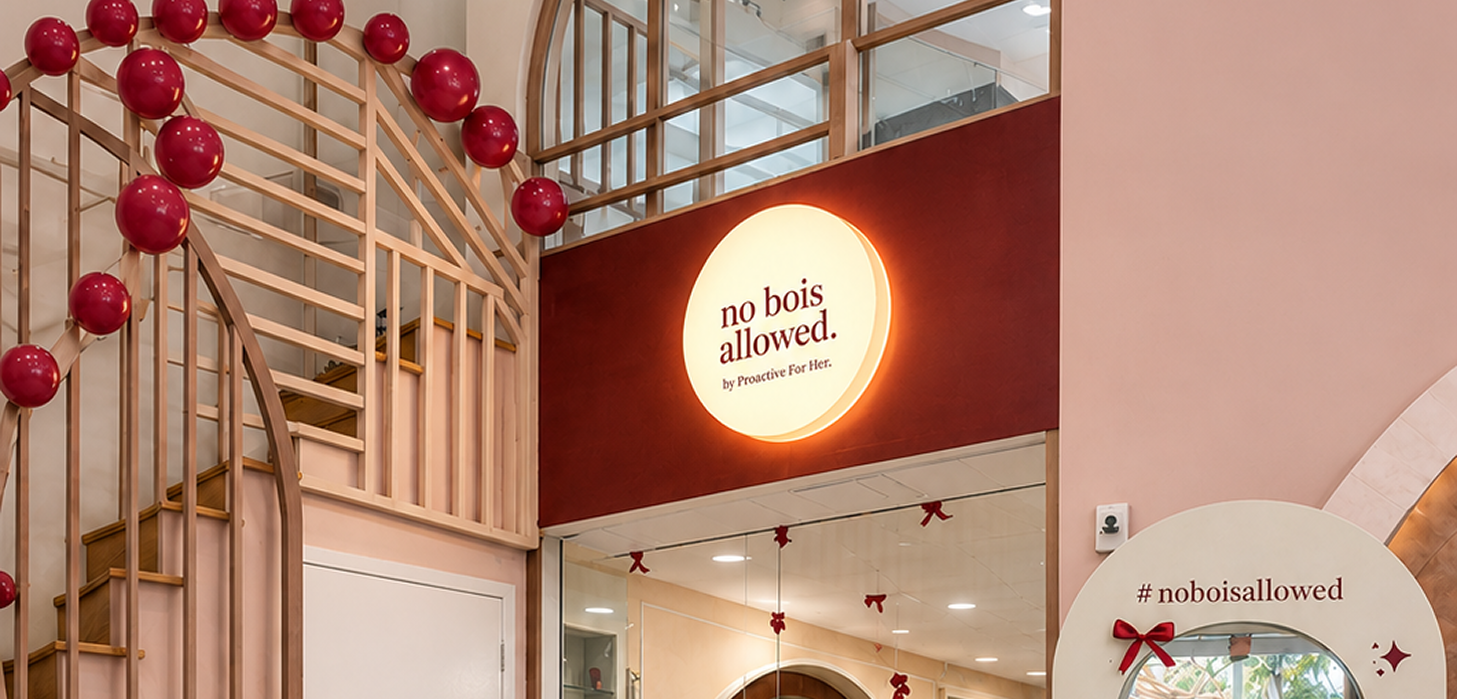
The identity steps into three dimensions here, threading through fixtures, lighting, and spatial detail to create an environment that feels unmistakably "no bois allowed" from the moment you walk in.
Designing "No Bois Allowed" meant thinking beyond the logo, identity, communication, and physical experience had to move as one system for the brand to feel distinct from its parent.