Marketing Design
Social content, ad creative, and email marketing for Proactive For Her, spanning reproductive health, pleasure, mental health, and everyday lifestyle. Colors for every pillar were deliberately chosen to make sensitive topics feel better and easier to approach.
Overview
Each format demanded something different. Social had to stay consistent day after day, ads had to grab attention fast, and email had room to slow down and go deeper. Together, they carried Proactive For Her's voice across every kind of moment a woman might encounter the brand.
Social media design
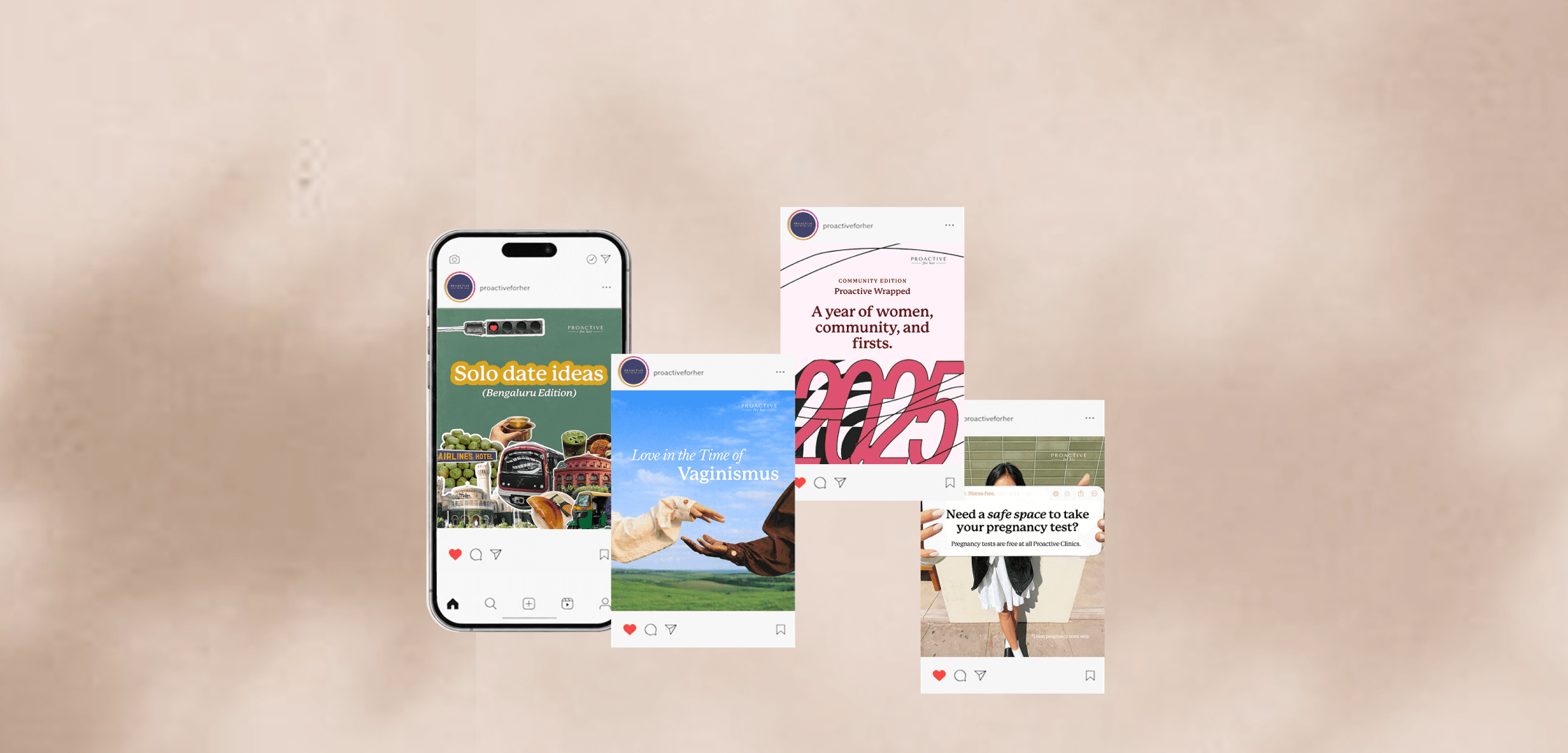
Every topic carries its own color, chosen deliberately so a woman recognizes what a post is about before she reads a word.
A sample from 200+ posts.
Ad creative
Unlike organic content, ad creative was built to move fast, testing different hooks, tones, and formats around one clear CTA each.
A sample of few more ads.
Email marketing
Ask The Therapist
Weekly advice-column newsletter.
How To Have Good Sex
Editorial-style health email.
Design system
Each clinical topic carries its own color: light blue for vaginismus, orange and pink for egg freezing, red for sexual health and periods, green for mental health, so a post reads before the caption does. Lifestyle content stays looser, an extension of personality rather than a coded topic. Ad creative breaks from this system entirely, testing different hooks and formats around one clear CTA each, while email carries the most editorial voice of the three.
Marketing design meant matching the format to the moment, a consistent voice for everyday social content, one sharp message per ad, and room to go deeper in email, all without losing the same brand at the center of it.