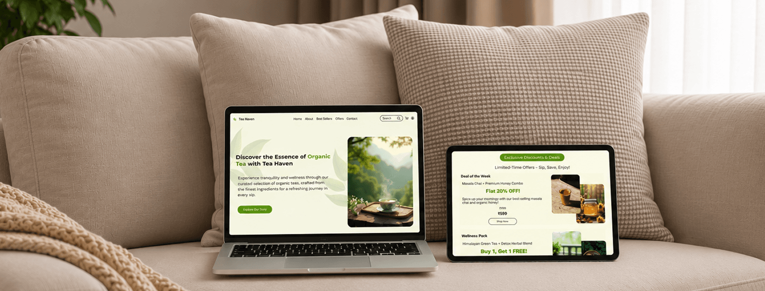

Tea Haven
Web DesignVisual HierarchyUI/UX DesignE-commerce DesignResponsive Design
A tea brand website designed with strong visual hierarchy to guide users from discovery to purchase.
Process
Wireframes established the content structure and browsing flow before the visual identity warm tones, natural textures, and clean typography was layered in.
Core Screens
Designed the Home, Product, and Collection pages, balancing rich imagery with clear navigation to keep the shopping experience effortless.
Design system
A consistent visual system built on earthy color palettes, generous whitespace, and reusable product cards to reflect the brand's calm, natural identity.
Designed to let the product breathe, the interface uses visual hierarchy and restraint to make browsing feel calm, intentional, and inviting.