💳 Fintech Onboarding
Type: Mobile Web App
Role: UI/UX Designer
Tools: Figma
Timeline: 1 week
✨ Overview
The Fintech Onboarding app establishes a frictionless entry point for users exploring a dual credit card offering. Through precise visual hierarchy and premium styling, the experience prioritizes clarity, trust-building, and speed—critical factors in financial product adoption.
"The objective was to make onboarding feel premium and effortless—transforming a typically tedious process into a moment of anticipation."
🎯 Goal
Design a mobile-first onboarding journey that effectively communicates product benefits while minimizing friction in the verification flow—ultimately driving higher completion rates and user confidence.
🌟 Core Features
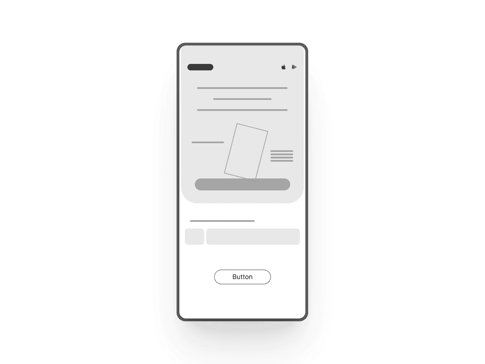
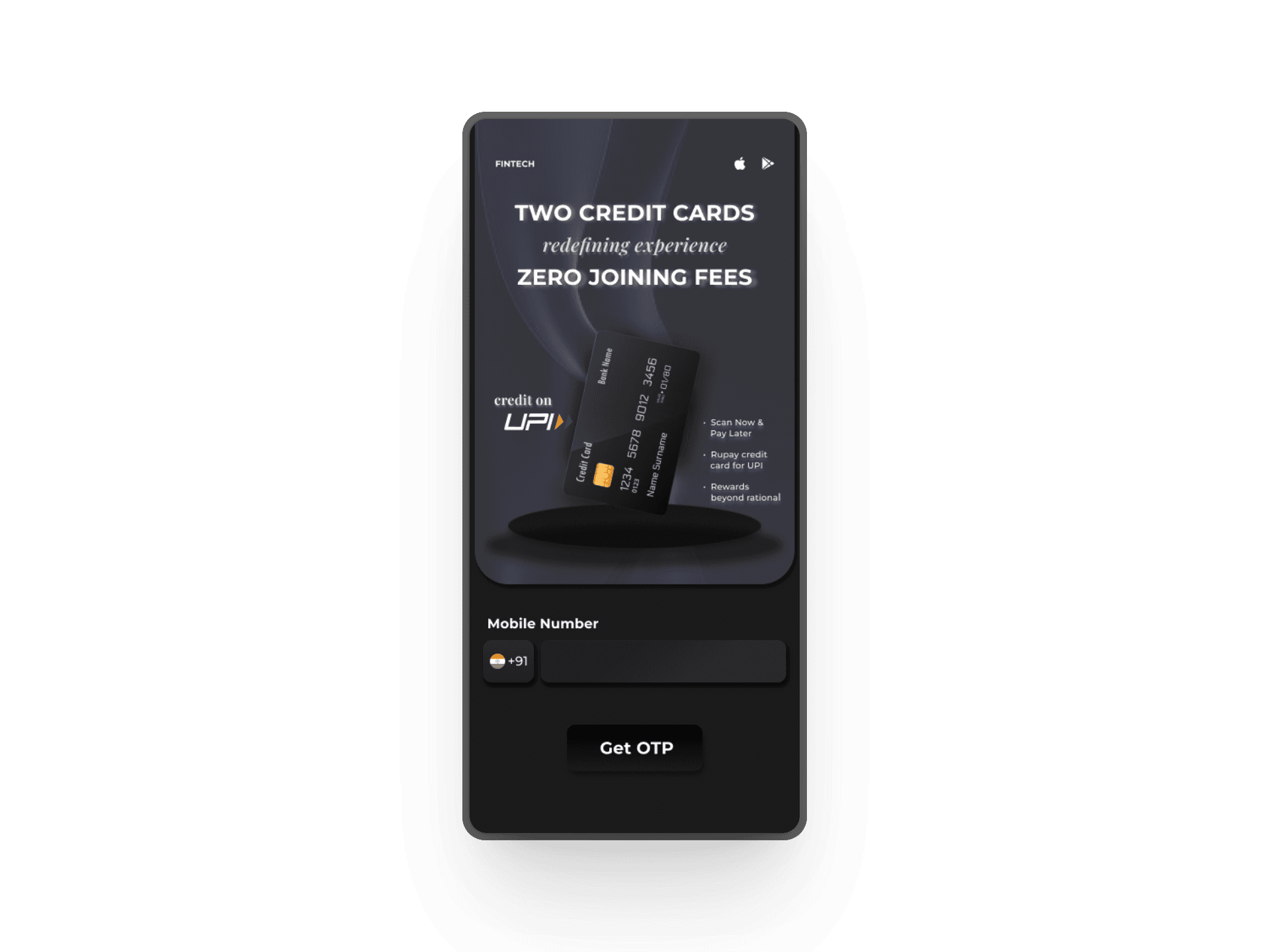
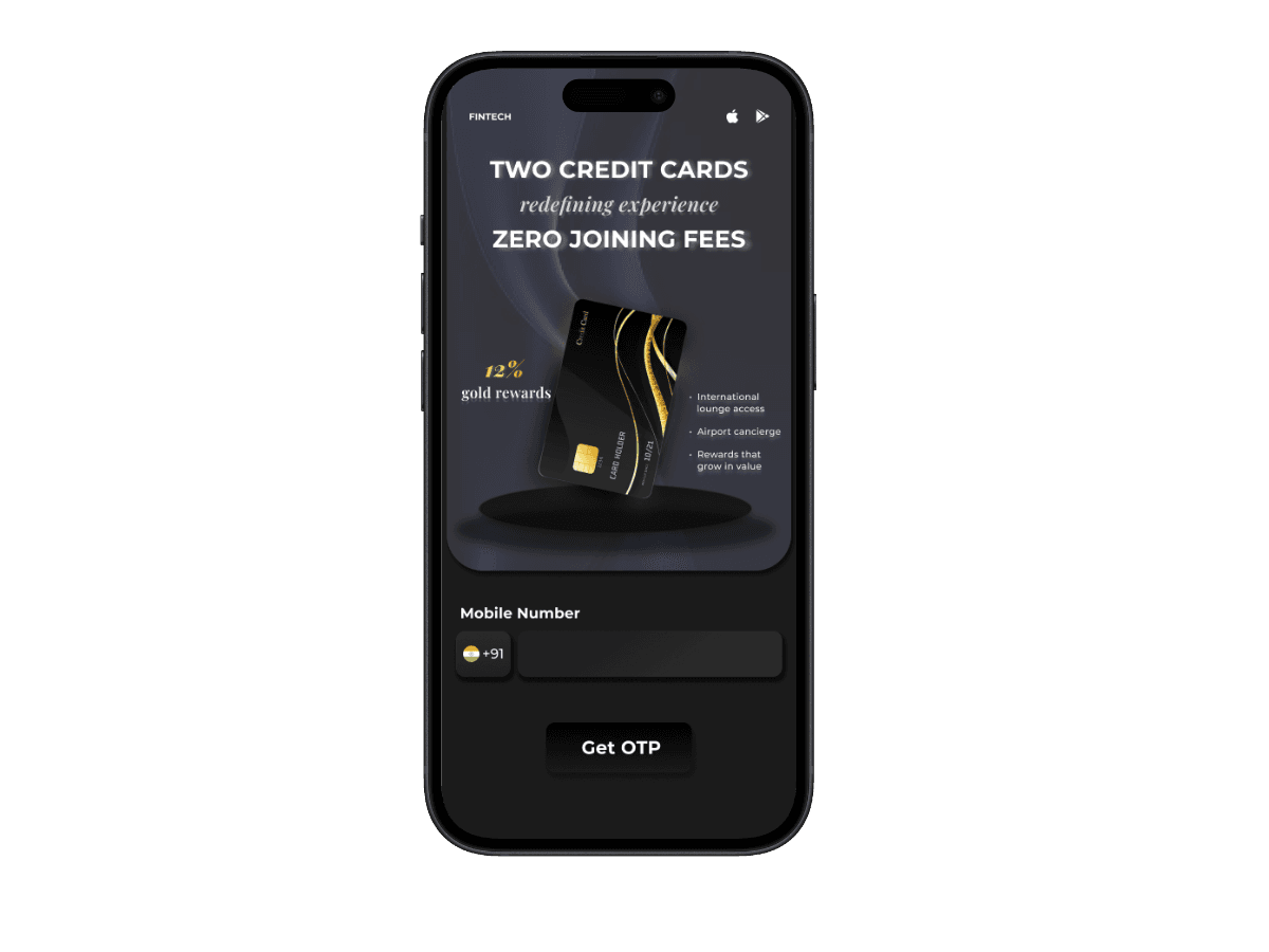
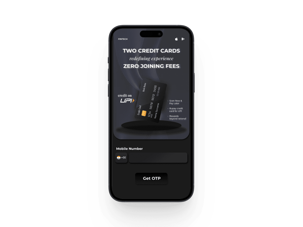
📱 Two-screen onboarding: Get OTP ➝ Verify OTP
💬 Mobile number input with prefilled +91 and flag
🧾 Clear, bold headline hierarchy to highlight offers
💎 Visual credit card renders for aspirational value
🔐 OTP input with individual boxes for better UX
🎯 One-step CTA buttons (Get OTP / Submit)


🎨 Design Strategy
This flow focuses on minimal friction and strong first impressions—leveraging glowing gradients, clean form inputs, and aspirational branding.
- Bold typography to emphasize key perks like ZERO JOINING FEES
- Gradient lighting to create depth and luxury feel
- Simple, guided input fields that focus attention
- Subtle shadow and card tilting for 3D effect and dynamism


🧰 Tools & Techniques
- Designed in Figma using reusable components
- Applied glassmorphism and shadow layers for depth
- Tuned layout for mobile responsiveness
- Color scheme optimized for trust, aspiration, and modernity
- Custom icon and flag integration for mobile input
💡 Lessons Learned
- First impressions drive conversion—onboarding must communicate value proposition within seconds
- OTP flows demand fluidity—visual clarity and progress indication significantly impact completion rates
- Contextual product visualization elevates perceived value and user engagement
- Single-CTA screens reduce cognitive load and improve conversion metrics
✅ Outcome
Delivered a conversion-optimized onboarding flow that transforms credit card applications into a compelling, secure, and streamlined experience—establishing trust and premium perception from the first interaction.
🔮 Next Steps
- Add real-time error validation and feedback
- Integrate social proof (user testimonials, ratings)
- Explore A/B testing on card placements and CTA wording
- Dark mode support for accessibility and comfort